Add Row
  Add
Add 


Stop Creating Boring Content: A Guide to Visual Content That Actually Works
Let me spill the tea on creating visual content that doesn't just exist but absolutely slays with your audience segments. Trust me, after years of watching LinkedIn influencers post "groundbreaking" insights like "content is king" (groundbreaking in 2010, maybe), I've learned a thing or two about what actually works.
The Art of Not Boring Your Audience to Tears
First things first: you need to know who you're creating content for, or you might as well be that person showing cat videos to their dog-loving friends. (Though let's be honest, who doesn't love a good cat video?)
Your Audience Segmentation Cheat Sheet (Because We All Need One):
Demographics: The basics like age, gender, and whether they prefer oat milk or are still team dairy
Interests: What makes them tick (besides their morning coffee)
Behavioral Data: Their online habits (including their guilty pleasure of watching unboxing videos at 2 AM)
Geographic Location: Because what works in Manhattan might make Melbourne scratch their head
Creating Content That Doesn't Make People Want to Delete Their Social Media
Infographics: The Art of Making Data Less Boring
Make those numbers tell a story your audience actually cares about. For example, instead of just showing "67% growth in Q3," tell them how that translates to real benefits: "That's like getting an extra free coffee every week!"
Use design elements that don't look like they're from 1999
Keep it simple - if your audience needs a PhD to understand it, you're doing it wrong
Real-World Win:
Take the case of Smoothie Supreme (not their real name, protecting the successful here). They created two versions of the same infographic about their ingredient sourcing. Version A was full of boring supply chain stats. Version B showed a fun "Journey of a Strawberry" with emoji-style graphics and relatable metrics like "traveled the equivalent of 1,000 yoga mats laid end to end." Guess which one got 400% more shares? (Spoiler: It wasn't the supply chain masterpiece.)
Videos: Because Reading is So Last Century
Tell stories that make your audience go "That's literally me!"
Match your video length to your audience's attention span (Pro tip: It's shorter than you think)
Include calls-to-action that don't sound like you're desperately begging for engagement
The TikTok Triumph:
Remember when Office Depot jumped on the "Things That Just Make Sense" trend? They turned boring office supplies into satisfying organizational videos that had Gen Z actually excited about file folders. Their engagement went through the roof faster than a paper airplane in a wind tunnel.
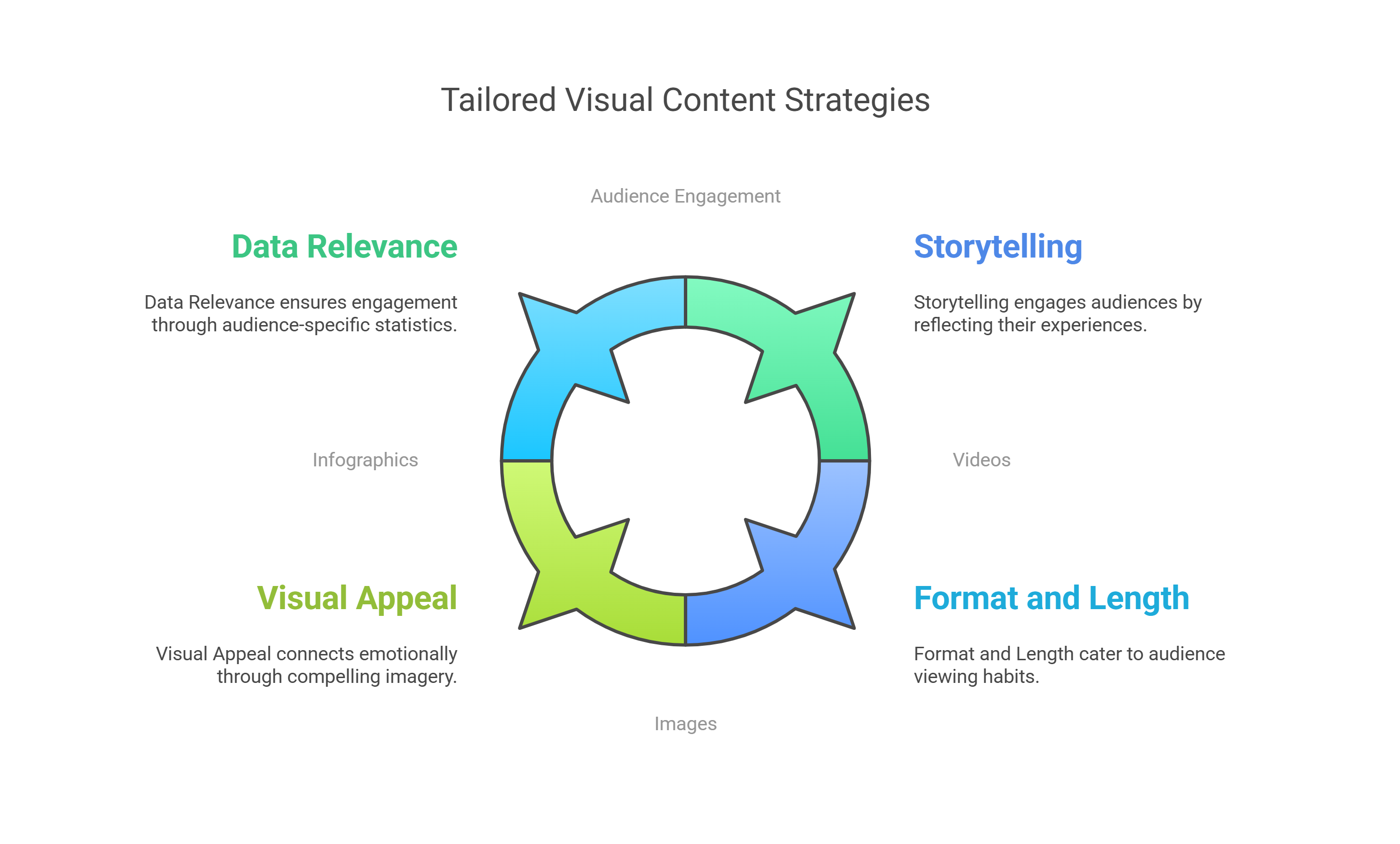
Images: Worth a Thousand Words (If Done Right)
Choose visuals that make your audience feel something besides the urge to scroll past
Stay culturally aware (nobody wants to be that brand that becomes a Twitter meme for the wrong reasons)
Keep your brand identity consistent, but not boring (yes, it's possible!)
Quick Win Example:
A local gym switched from generic "before and after" photos to candid shots of members celebrating personal victories (like finally mastering the water cooler without spilling everywhere). Their Instagram engagement tripled, and membership inquiries went up 45%. Turns out people love real humans doing real human things!
The "Wait, What?" Test
Before you hit publish on any visual content, run it through the "Wait, What?" test:
Would you stop scrolling to look at it?
Could you explain it to your grandma in under 30 seconds?
Does it make you feel something other than confusion?
Would you share it without being bribed with free coffee?
If you answered "no" to any of these, it's back to the drawing board!

Measuring Success (Or Why Your Boss Actually Pays You)
Track those metrics like a helicopter parent tracks their kid's phone - views, shares, conversions, the whole nine yards. But remember, vanity metrics are like Instagram filters - they might make things look pretty, but they don't tell the whole story.
Insight: Create a monthly "Content Victory Lap" report where you showcase your wins with actual ROI numbers. Include screenshots of positive comments and engagement. Your boss will love it, and you'll have ammunition for your next performance review. Win-win!
Final Notes
Look, creating tailored visual content isn't rocket science (thank goodness, because I barely passed physics). It's about understanding your audience like you understand your coffee order and creating content that makes them stop mid-scroll. Get this right, and you'll be the marketing MVP your audience didn't know they needed.
Remember: In a world full of generic content, be the scroll-stopping masterpiece your audience deserves. Now go forth and create content that makes your competitors wonder what kind of magic you're wielding!
P.S. If anyone tells you "that's not how we've always done it," remind them that we used to think QR codes were dead too. Look how that turned out! 😉
And hey, if all else fails, just remember: At least you're not still trying to make MySpace work in 2025. Now THAT would be a real marketing challenge! 🎭